
Design
Susan Kare: The Pixels That Made Computers Human
How a graphic designer turned tiny symbols into a friendlier way to use technology.

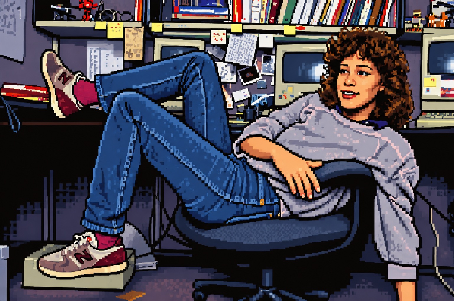
A computer can feel like a machine—or an invitation. Susan Kare helped make it the latter. Joining Apple in 1982, she created screen graphics for the original Macintosh: small images with an unusually human touch.
A big idea in a tiny grid
Kare began sketching on graph paper, treating each square as a pixel. Working with limited space and one color, she made symbols people could recognize without a technical vocabulary. Her achievement was not detail for its own sake, but clarity with personality.
The symbol hiding on your keyboard
Asked to find an alternative to Apple's logo for the Command key, Kare searched a symbol dictionary. She chose a looped symbol used in Sweden to mark sightseeing attractions. It was friendly, distinctive and easy to render in pixels. It still appears on Mac keyboards.
More than decoration
Her icons and typefaces helped give the Macintosh its approachable character. Later clients included Microsoft, IBM and Facebook. Her early sketches are now in the collections of MoMA and SFMOMA: evidence that an everyday interface can also be significant design.
Why she matters
Kare showed that graphic design shapes behavior, not just appearances. A good symbol reduces hesitation; a little warmth makes an unfamiliar tool feel usable. For any brand or website, her lesson holds: make the next step clear, then give it a human voice.
Sources: Susan Kare at MoMA · Computer History Museum.